01


Brand
IDENTITY


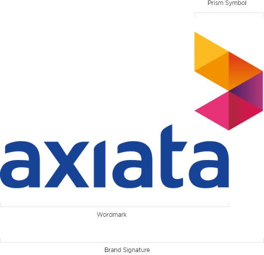
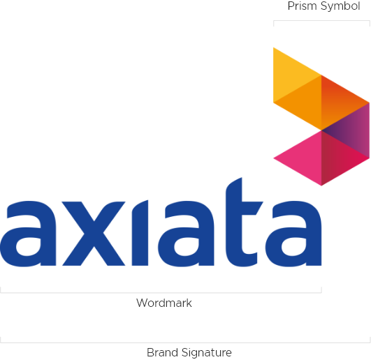
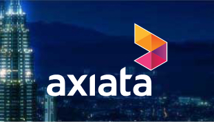
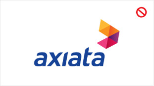
As a diverse Group with a unique footprint across Asia, we needed a name that has an allusion to our Asian heritage with a global sound and a modern edge.

Axiata is our proud name and it is pronounced a-zee-ata. Our logo is called the Axiata prism and along with our exciting name, the identity mirrors the Group’s rich heritage and cultural diversity. It is as colourful as the countries that we serve and displays the Group’s vibrant energy, reflecting how Axiata views situations from every perspective, uniting partners and connecting customers throughout Asia and the rest of the world.

02


CORPORATE
IDENTITY


Our brand signature is a representation of who we are and what we stand for. The purpose of these guidelines is to protect and enhance this invaluable asset.

The Axiata prism symbol is the representation of the Multi-dimensional within our brand. The relationship between the symbol and wordmark is fixed and should not be altered. Always use the approved electronic identity artwork for reproduction.


To use the Axiata brand kit, kindly email us at [email protected]. Please state your name, organisation and the reason you are requesting access

03


VARIATION


Vertical Brand Signature

In order to create a flexible system for the brand signature, three different variations are available for different applications.

Here are the rules that must be followed: The full colour version in gradient must be used whenever possible, in all communications, but if applying the brand signature on smaller applications, please use the full colour version in solid colour; the single colour and monotone versions may be used in one-colour materials.


Full colour version in
gradient colour

Full colour version in
solid colour

Monotone version

Single colour version


Horizontal Brand Signature

The horizontal brand signature lockups are to use only in extreme situations when the vertical lockup can not be applied. The normal brand signature lockup should be used whenever possible throughout all communication materials.

The colour of the prism symbol is fixed, and should not be altered. Always use the approved electronic identity artwork for reproduction.


To use the Axiata brand kit, kindly email us at [email protected]. Please state your name, organisation and the reason you are requesting access

Full colour version in
gradient colour

Full colour version in
solid colour

Monotone version

Single colour version

04


MINIMUM SPACE
AND SIZE


Minimum Clear Space

Our brand signature deserves to stand apart, as an expression of our integrity and commitment.

For maximum impact and legibility, always maintain ample clear space around the Axiata brand signature. This ensures an impression of clarity, strength and simplicity that supports our brand.

For extreme cases, the minimum clear space can be increased to 2X, but the preference should always be 1X.


Minimum clear space
vertical brand signature

Minimum clear space horizontal brand signature

This simple rule is important in preventing the brand signature from being overcrowded, which would detract from its impact.


Minimum Size

Minimum brand signature sizes have been established to maintain optimum legibility and quality in every expression of the Axiata brand.

The recommended sizes are measured by the X-height of one triangle from the corporate symbol.

X is our standard measurement which is equal to the vertical height of one triangle in the logo as well as the “a” in Axiata. This is called the X-height.

Do not reproduce the brand signature any smaller than the sizes as it loses readability.


To use the Axiata brand kit, kindly email us at [email protected]. Please state your name, organisation and the reason you are requesting access


Minimum space vertical brand signature

Minimum space horizontal brand signature
05


TAGLINE LOCKUP

Stacked version treatment
Horizontal version treatment
Linear version treatment

Taglines are often developed to communicate a company’s philosophy and vision. “Advancing Asia” conveys our mission to be Asia’s leader in telecommunication, with a commitment to improving people’s daily lives.

Additional typography in relationship to the Axiata brand signature can reinforce and extend the company’s philosophy and vision when used properly.

The size and proportion of the brand signature to the wordmark are locked and should remain the same at all times. Always follow this guide when using the tagline with the brand signature.

Linear version is an extreme case which would be used for very narrow applications, such as viaduct under an overhead bridge.


Malay version treatment
Chinese version treatment

Tagline Lockup in
Other Languages

Minimum brand signature sizes have been established to maintain optimum legibility and quality in every expression of the Axiata brand.

The recommended sizes are measured by the X-height of one triangle from the corporate symbol.

X is our standard measurement which is equal to the vertical height of one triangle in the logo as well as the “a” in Axiata. This is called the X-height.


To use the Axiata brand kit, kindly email us at [email protected]. Please state your name, organisation and the reason you are requesting access

06


DO’S AND
DON’TS


Colour policy

Correct use of colour is vital when reproducing the Axiata brand signature.

The examples shown on this page demonstrate how careful control and use of the brand signature with different backgrounds must be adhered to at all times to ensure accurate and consistent representation of the brand.

The preferred Axiata colour brand signature is the full colour version appearing on a white background and should be used whenever possible.

For the single colour version of the Axiata brand signature, only Axiata blue, Axiata Red, monotone, black and white is allowed. Any secondary colours such as Axiata green, denim and turquoise are not permitted to apply in the Axiata brand signature.

When there is not enough contrast between the background and the logo, always use the outline version of the Axiata brand signature.

The colour of the prism symbol is fixed, and should not be altered. Always use the approved electronic identity artwork for reproduction.


Full colour version on white background

Reverse full colour version on Axiata Blue

Full colour version on light colour background

Reverse full colour version on Axiata Red

Single colour version on white background

Reverse full colour version on photographic background

Black & white colour version on white background

Reverse single colour version on colour background

Monotone version on white background

Reverse black & white colour version on black background


Application of
Brand Signature

To preserve and reinforce the Axiata brand signature, never alter or reposition any elements of the Axiata brand signature. Always reproduce the brand signature in the specific colours and lockups as indicated in this manual.

Although the examples on the left do not represent every misuse, they do illustrate some common mistakes that must be avoided when using the Axiata brand signature.


Never alter any elements (symbol & wordmark) of the brand signature

Never reproduce the brand signature in a different colour against a dark background

Never fill the brand signature with a photographic image or texture

Never reproduce the brand signature in Axiata Blue against a photographic image

Never reproduce the brand signature in a different colour

Never reproduce the brand signature with drop shadow effect on any background

Never reproduce the signature on a textured or complex background that may impair legibility

Do not transpose the Colours of the brand signature. If the Axiata logotype is black, the symbol must also appear in black


Application of
Background Colour

When the Axiata brand signature is being used for sponsorship purposes, always place the brand signature on a background with sufficient contrast.


Do not place the signature on a background with a similar colour tone to the signature

Always place the brand signature on a background with sufficient contrast

Do not place the brand signature on a background with insufficient contrast

Always place the brand signature on a background with sufficient contrast

Do not place the brand signature on a background with insufficient contrast

Always place the brand signature on a background with sufficient contrast

Do not remove the prism symbol outline on a background colour with insufficient contrast

Always place the prism symbol with outline on a background colour with sufficient contrast