![]()
Our brand icon is a representation of who we are and what we stand for. The purpose of these guidelines is to protect and enhance this invaluable asset.
The relationship between the prism icon is fixed and should not be altered. Always use the approved electronic identity artwork for reproduction.

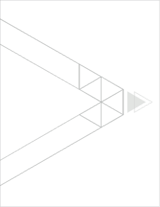
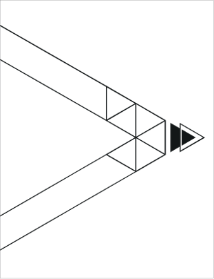
In order to create a flexible system for the Prism icon, different variations are available for different applications.
Here are the rules that must be followed:
The full coloured version in gradient must be used whenever possible in all communications. Otherwise, apply the full coloured version in solid colour when required. Utilise the single colour and monotone versions in one-colour materials
The colour of the prism icon is fixed, and should not be altered. Always use the approved electronic identity artwork for reproduction.

Full colour version in gradient colour

Monotone version

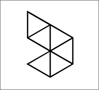
Outline version

Full colour version in solid colour

Single colour version
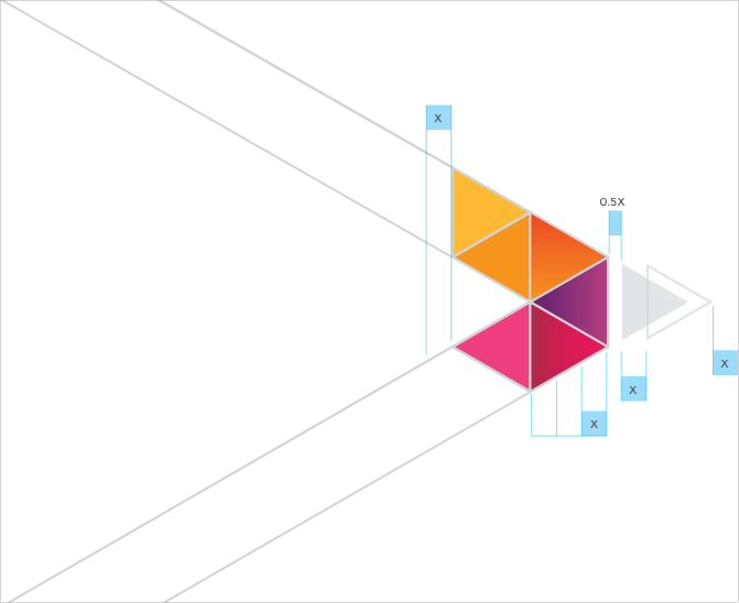
Clear Space & Size
Minimum clear space
Our Prism icon deserves to stand apart, as an expression of our integrity and commitment.
For maximum impact and legibility, always maintain ample clear space around the Axiata brand icon. This ensures an impression of clarity, strength and simplicity that supports our brand.
For extreme cases, the minimum clear space can be increased to 2X, but the preference should always be 1X.
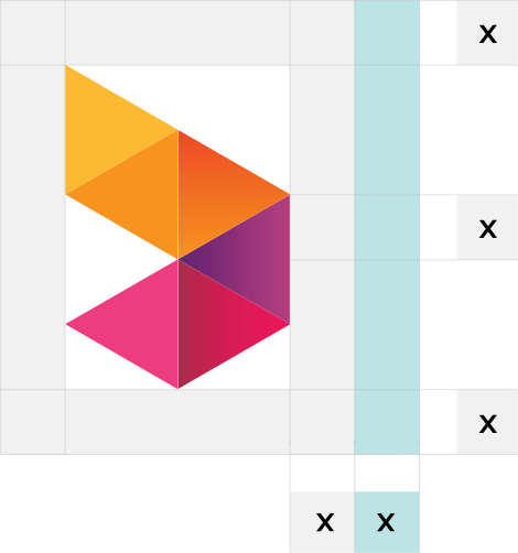
Minimum size
Minimum Prism icon sizes have been established to maintain optimum legibility and quality in every expression of the Axiata icon.
The recommended sizes are measured by the X-height of half triangle from the prism icon.
X is our standards measurement which is equal to the vertical height of half triangle in the icon.
Minimum clear space
This simple rule is important in preventing the Prism icon from being
overcrowded, which would detract from its impact.

5mm

5mm

5mm

5mm
Minimum size
The minimum size of reproduction is shown below. Do not reproduce the
Prism icon any smaller than the above sizes as it loses readability.
Correct use of colour is vital when reproducing the Axiata prism icon.
The examples shown on this page demonstrate how careful control and use of the Prism icon with different backgrounds must be adhered to at all times to ensure accurate and consistent representation of the brand.
The preferred Axiata colour brand signature is the full colour version appearing on a white background and should be used whenever possible.
For the single colour and outline version of the Axiata prism icon, only Axiata blue, Axiata Red, monotone, black and white is allowed. Any secondary colours such as Axiata green, denim and turquoise are not permitted to apply in the Axiata prism icon.
When there is not enough contrast between the background and the logo, always use the outline version of the Axiata brand signature.
The colour of the prism icon is fixed, and should not be altered. Always use the approved electronic identity artwork for reproduction.

Full colour version on white background

Full colour version on Axiata Blue

Full colour version on photographic background

Full colour version on light colour background

Full colour version on Axiata Red

Single colour version on white background

Black & white colour version on white background

Single colour version on Axiata Red
Outline version on White background

Monotone version on white background

Monotone version on dark colour background

Outline version on colour background
When the Axiata Prism icon is being used for sponsorship purposes, always place the brand signature on a background with sufficient contrast.

Do not place the icon on Axiata Red background without white outline

Never reproduce the brand icon in a different colour

Do not place the icon or pointing directly on people’s faces

Never reproduce the icon on a busy textured background that may impair legibility

Never fill the brand icon with a photographic image or texture

Never reproduce the icon with drop shadow effect on any background

Never alter any elements of the brand icon

Do not flip the brand icon

Always place the icon with outline on a background colour with sufficient contrast

Always place the brand icon on light or less busy textured background

Always place the icon with outline on a background colour with sufficient contrast

Always place the icon on less busy photographic background

Always place the icon on a background with sufficient contrast

Outline version on white background

Always place the icon on a background with sufficient contrast

Do not flip the brand icon